Emblematically Speaking - Ashton Town
Thu 15th September 2022 | Ashton Town | By Stewart Taylor
Emblematically Speaking - Ashton Town
Ian Pomfrett, the Programme Editor of Ashton Town, takes us through the story of the evolution of the Ashton Town badge - with occasional interruptions from me.
Ashton Town began life in 1953 as Makerfield Mill FC - The works team for the mill of the same name in the town, and originally played at a ground in Windsor Road in Ashton-in-Makerfield.
However, in 1962, while playing in the Warrington and District Amateur League, the club were renamed Ashton Town and moved home matches to a public park pitch at Whithill Street Recreation Ground in Bryn. Then in 1964, the club purchased their current home ground at Edge Green Street, which had previously hosted Stubshaw Cross Rovers.
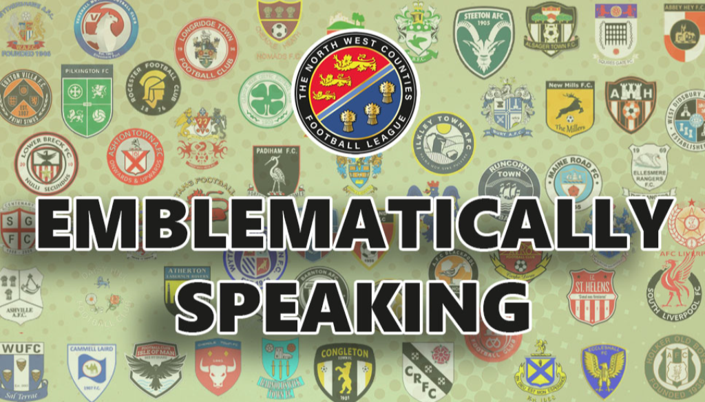
From the start of the club’s formation, the emblem was a traditional embroidered affair containing the initials MMFC, which can be seen on the player’s shirts in a number of team photos from the time.
(as Ian says, this is embroidered into the shirts which was one of the very few methods of applying a badge to a shirt in those days. Nowadays the processes have evolved to allow just about any design to be applied)
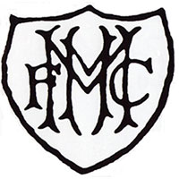
During the early 1960s, the then Ashton Town President Jimmy Cahill was a player at the club and has confirmed that around the time of the move to the present ground at Edge Green Street, the club committee decided to adopt a new emblem based on the town crest of Ashton-in-Makerfield, with the addition of a football on top of the hand that sits at the top of the shield.
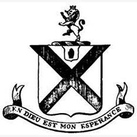
(here we see a monochrome and a colour image as described by Ian. We will note several features which are frequently found on Town Coats of Arms. The red cross comes from the Coat of Arms of the hugely significant Gerard family. The open hand represents faith, humanity and justice. The lion rampant – standing on one leg is a regular feature of many Coats of Arms and represents courage, nobility and strength entirely appropriate for the “King of Beasts”. We also see a motto in French en dieu est mon esperance which translates as in god is my hope.)
In 2013 a golden circular badge was designed to commemorate 60 years since foundation in 1953.
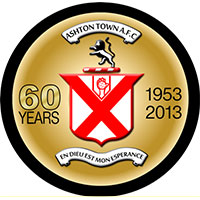
(in addition to the 60 year commemoration this emblem has seen a change from the town Coat of Arms style to a more modern roundel. Perhaps a better shape for the manufacture of pin badges but certainly more modern)
The Chairman Mark Hayes instigated another change to the emblem, with the addition of an outer circle around the existing emblem, containing the club name and the words “Onwards and Upwards” – a well used phrase representing ambition.
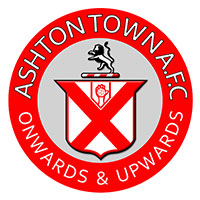
(note here that the French motto has disappeared to be replaced as displayed)
In 2022, we saw a full redesign of the crest, a return of the French motto "en dieu est mon esperance" (in God is my hope) and an official name change to Ashton Town FC.
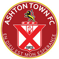
(through most of the changes described above we see the consistency of the interpretation of the Town Coat of Arms firmly wedding the club into its locality)
So there we have the story of the development of a football club badge over the better part of the 70 years since the foundation of the club and the thinking behind the changes.
In our experience it is quite rare to find such detail and I am indebted to Ian for his input on this one.
Some of this information appeared in the original Emblematically Speaking article on Ashton Town but warrants repeating to give context to the full story.
Emblematically Speaking - Ashton Town
Thu 15th September 2022 | Ashton Town
By Stewart Taylor
Emblematically Speaking - Ashton Town
Ian Pomfrett, the Programme Editor of Ashton Town, takes us through the story of the evolution of the Ashton Town badge - with occasional interruptions from me.
Ashton Town began life in 1953 as Makerfield Mill FC - The works team for the mill of the same name in the town, and originally played at a ground in Windsor Road in Ashton-in-Makerfield.
However, in 1962, while playing in the Warrington and District Amateur League, the club were renamed Ashton Town and moved home matches to a public park pitch at Whithill Street Recreation Ground in Bryn. Then in 1964, the club purchased their current home ground at Edge Green Street, which had previously hosted Stubshaw Cross Rovers.
From the start of the club’s formation, the emblem was a traditional embroidered affair containing the initials MMFC, which can be seen on the player’s shirts in a number of team photos from the time.
(as Ian says, this is embroidered into the shirts which was one of the very few methods of applying a badge to a shirt in those days. Nowadays the processes have evolved to allow just about any design to be applied)
During the early 1960s, the then Ashton Town President Jimmy Cahill was a player at the club and has confirmed that around the time of the move to the present ground at Edge Green Street, the club committee decided to adopt a new emblem based on the town crest of Ashton-in-Makerfield, with the addition of a football on top of the hand that sits at the top of the shield.
(here we see a monochrome and a colour image as described by Ian. We will note several features which are frequently found on Town Coats of Arms. The red cross comes from the Coat of Arms of the hugely significant Gerard family. The open hand represents faith, humanity and justice. The lion rampant – standing on one leg is a regular feature of many Coats of Arms and represents courage, nobility and strength entirely appropriate for the “King of Beasts”. We also see a motto in French en dieu est mon esperance which translates as in god is my hope.)
In 2013 a golden circular badge was designed to commemorate 60 years since foundation in 1953.
(in addition to the 60 year commemoration this emblem has seen a change from the town Coat of Arms style to a more modern roundel. Perhaps a better shape for the manufacture of pin badges but certainly more modern)
The Chairman Mark Hayes instigated another change to the emblem, with the addition of an outer circle around the existing emblem, containing the club name and the words “Onwards and Upwards” – a well used phrase representing ambition.
(note here that the French motto has disappeared to be replaced as displayed)
In 2022, we saw a full redesign of the crest, a return of the French motto "en dieu est mon esperance" (in God is my hope) and an official name change to Ashton Town FC.
(through most of the changes described above we see the consistency of the interpretation of the Town Coat of Arms firmly wedding the club into its locality)
So there we have the story of the development of a football club badge over the better part of the 70 years since the foundation of the club and the thinking behind the changes.
In our experience it is quite rare to find such detail and I am indebted to Ian for his input on this one.
Some of this information appeared in the original Emblematically Speaking article on Ashton Town but warrants repeating to give context to the full story.