Emblematically Speaking - Pilkington
Thu 15th December 2022 | Pilkington | By Martin Fallon
In the original series of articles under the Emblematically Speaking banner we had a detailed look at the badge of St Helens Town – sadly no longer with us in the NWCFL.
The design of the St Helens Town badge was, and still is, essentially the St Helens Coat of Arms. Even though we have to thank the Local Government Reorganisation Act of 1972 – enacted in 1974 – for the creation of St Helens Metropolitan Borough the Coat of Arms is extremely traditional.
At first glance, Pilkington’s badge looks to be nothing like a traditional town Coat of Arms and, indeed, it isn’t but what it does do is to bring together many of the elements of the St Helens Coat of Arms and pitches them into a stylish, modern setting.
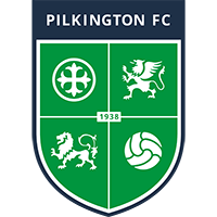
So what do we see? A very simple shield design with four quadrants. In each of the quadrants we see a symbol which tells us a great deal.
The device (charge) to the top left is the symbol of the Pilkington Glass Company – a hugely significant employer in the town. The company is known worldwide and was responsible for many of the innovations in glass making which help to shape the modern world. In a later article we will cover in a bit of detail the routes to formation of football clubs but suffice to say at this stage that Pilkington FC can be considered to be a works team.
Top right is the Griffin of Bold representing the Rainhill, Bold and Whiston districts of the Borough. This device was also found on the original St Helens Coat of Arms dated 1876 and refers to the legendary carnivorous monster with the head and wings of an eagle and the body of a lion. It regularly flew around the wide Mersey estuary, swooping low over the marsh and picking up the villager’s cattle to take back to its lair. The sight of this winged beast struck fear into the hearts of the villagers, who could do nothing to stop its attacks. The Griffin makes up the major part of the Coat of Arms of the Bold family of Bold but local residents might imagine that the Griffin of Bold is the Chef & Brewer at Bold Heath on the A57 and, of course, it is.
Bottom left is a lion, another element from the 1876 design and represents the Walmsley family. The depiction here, in heraldic terms, is of a lion passant – essentially walking with the right forepaw raised. As the “King of the Beasts, a lion represents all that is strong and good in terms of qualities. Here we can think about, strength, courage and nobility amongst others.
Bottom right is a football and we need say no more about what that represents.
In the centre we see the year of formation of the club.
The cross which divides the shield into its four parts is derived from the Coat of Arms of the Pilkington family and represents Windle – the area in which the stadium is located.
To top it all off we see the name of the club in a modern sans serif script.
This badge was adopted when Pilkington joined the NWCFL for the 2019/20 season but its form still harks back to the original crest that was first designed for the Club in the early seventies.
Secretary of Pilkington FC, Paul Pinder, commented “The crest has been simplified and modernized and its simplification has created a modern and more vibrant design. We were keen that it stayed true to our roots – St Helens and Pilkington Glass – and we have definitely achieved this. We have gradually reintroduced the ‘Pilkington’ green over the last few years after moving towards blue in the early 2000’s and the updating of the crest to prominently feature this is another step in reaffirming our history and culture.”
And, if I may say so, it does exactly that.
Emblematically Speaking - Pilkington
Thu 15th December 2022 | Pilkington
By Martin Fallon
In the original series of articles under the Emblematically Speaking banner we had a detailed look at the badge of St Helens Town – sadly no longer with us in the NWCFL.
The design of the St Helens Town badge was, and still is, essentially the St Helens Coat of Arms. Even though we have to thank the Local Government Reorganisation Act of 1972 – enacted in 1974 – for the creation of St Helens Metropolitan Borough the Coat of Arms is extremely traditional.
At first glance, Pilkington’s badge looks to be nothing like a traditional town Coat of Arms and, indeed, it isn’t but what it does do is to bring together many of the elements of the St Helens Coat of Arms and pitches them into a stylish, modern setting.
So what do we see? A very simple shield design with four quadrants. In each of the quadrants we see a symbol which tells us a great deal.
The device (charge) to the top left is the symbol of the Pilkington Glass Company – a hugely significant employer in the town. The company is known worldwide and was responsible for many of the innovations in glass making which help to shape the modern world. In a later article we will cover in a bit of detail the routes to formation of football clubs but suffice to say at this stage that Pilkington FC can be considered to be a works team.
Top right is the Griffin of Bold representing the Rainhill, Bold and Whiston districts of the Borough. This device was also found on the original St Helens Coat of Arms dated 1876 and refers to the legendary carnivorous monster with the head and wings of an eagle and the body of a lion. It regularly flew around the wide Mersey estuary, swooping low over the marsh and picking up the villager’s cattle to take back to its lair. The sight of this winged beast struck fear into the hearts of the villagers, who could do nothing to stop its attacks. The Griffin makes up the major part of the Coat of Arms of the Bold family of Bold but local residents might imagine that the Griffin of Bold is the Chef & Brewer at Bold Heath on the A57 and, of course, it is.
Bottom left is a lion, another element from the 1876 design and represents the Walmsley family. The depiction here, in heraldic terms, is of a lion passant – essentially walking with the right forepaw raised. As the “King of the Beasts, a lion represents all that is strong and good in terms of qualities. Here we can think about, strength, courage and nobility amongst others.
Bottom right is a football and we need say no more about what that represents.
In the centre we see the year of formation of the club.
The cross which divides the shield into its four parts is derived from the Coat of Arms of the Pilkington family and represents Windle – the area in which the stadium is located.
To top it all off we see the name of the club in a modern sans serif script.
This badge was adopted when Pilkington joined the NWCFL for the 2019/20 season but its form still harks back to the original crest that was first designed for the Club in the early seventies.
Secretary of Pilkington FC, Paul Pinder, commented “The crest has been simplified and modernized and its simplification has created a modern and more vibrant design. We were keen that it stayed true to our roots – St Helens and Pilkington Glass – and we have definitely achieved this. We have gradually reintroduced the ‘Pilkington’ green over the last few years after moving towards blue in the early 2000’s and the updating of the crest to prominently feature this is another step in reaffirming our history and culture.”
And, if I may say so, it does exactly that.